EXPERIMENT 2- The Bridge
The Design Theory
My theory is based off of a house located in India, built the Matharoo Associates. The significance of this house's architecture is within its walls. The house was designed so that multiple generations of the same family could live dynamically alongside each-other. In India it is common practise for married couples to live in their parents house. Every exterior wall and a few internal walls are mounted on pivots so that they can be electronically turned. the rotating of these walls instantly creates new spaces, whilst also blocking off other areas. These walls are multipurpose as they can act as a safety mechanism to protect the house from intruders when all the walls are closed, fortifying the house. In addition, the walls are also utilised as a method of manipulating the amount of sunlight and airflow entering the house, depending on the angle the wall is at. I ultimately adapted the idea of moving walls in my Bridge building in order to create a multipurpose, transformable and adaptable space.
Chosen words
pivot
privacy
light
transforms
directions
cocooned
transforms
directions
cocooned
Photos of the house
Link to article:
week 1
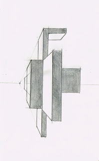
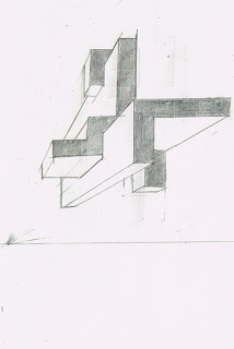
18- 1 point perspectives
Middle Horizon
Low Horizon
High Horizon
perspective sentences
Process Photos
stage 1
this is the base shape of the bridge.
stage 2
Above you can see how the shape fits around the Roudhouse and intertwines with surrounfing buildings.
stage 3
after futher planning i decided that the building was too large, in that it blocked too much space and had too much excess unusable space. in addition to this, the buildings that i connected to were uneccisary. Moreover i decided to downsize the shape to fit around 4 buildings: the Roundhouse, Squarehouse, Law Building and Blockhouse.
stage 4
This Image of my bridge building shows some major developments from my last image. I decided to move the lecture theatre underground, this not only added further depth to my building, but it also got rid of the awkward looking shape sitting on-top of the Squarehouse with no real connection to the actual building below.
Architecture and arrangement of rooms:
The fluid nature of this house, not only stems from the curvatures in the architecture. The interior of the building itself is open and flowing, with different spaces merging into each-other. This seemingly open interior allows the people within the space to be more creative with their use of the space, as they are not confined by solid walled off rooms. Instead, spaces are able to be customised. The idea behind this unique arrangement of spaces is to amplify an individuals creative process.
Lecture theatre
The lecture theatre is located underground below the gallery section of the elevated bridge. The area that the lecture theatre takes up is 87.8m2. This lecture theatre is fairly intimate and casual, there are no fixed seats, instead there are cement steps and an assortment of seat cushions. This simplicity ultimately creates a more relaxed environment for learning, as architecture lectures tend to be a more casual experience.
Offices/ meeting room
located on level 2, There are 4 office booths in the building. these offices are separated by moving walls, making the space transformable and fluid. The Area of the office room is 123.8 m2 including the meeting room.
Public study area
The public study areas throughout the building amount to an Area of
182.29m2. Tables can be found mainly in one large bend in the bridge. This was strategically placed so as to position it close to the studio rooms for accessing faculty computers and printing. In addition, the space is out of the way of the louder and more public areas of the building such as the main spiral staircase and the gallery area which is a major thoroughfare for students moving to and from this building and the Squarehouse. in this area students are free to to work in between classes and after hours.
Tutorial rooms
The tutorial rooms are the most significant aspect of the building. The area of this space is divided into 4 sections by the transformable walls. These moving walls walls in the space, enable tutorials in the space to be either dynamic and collaborative or create a private or intimate setting. The room as a whole has an Area of: 396.35m2. in addition to changing the size ad privacy of the classroom, the walls can also be used as a gallery space for student pin ups.
Gallery
The gallery space covering an Area of: 82.69m2 is incorporated into the main walkway, from the Squarehouse end of the building stretching to the public study area. In this area there are numerous glass display cases to exhibit staff and student works.
Rooftop Garden/ viewing deck
The Rooftop Garden has an Area of 269.25m2. This space in itself is dynamic without having any moving element aspects to its architecture. This rooftop garden, not only provides a space for relaxing and eating for staff and students, The space is in itself also a classroom. Due to its high vantage point, it is easy to observe the surrounding skyline. located on this level are coin operated style binoculars, offering people with a clearer and more focused view on the surrounding architecture at UNSW and Anzac Parade. Moreover, giving staff and students the ability to study and to an extent do primary research of the area from this space.
Computers/ printing area
Computers are mainly located in 2 parts of the building. these computers provide students and staff access to modelling software and literary databases otherwise unobtainable on their own devices. In addition, the computers located next to the Studio spaces can also be used for laser printing up to A1 sheets, ideal for Pin-ups.
Library
I found that there was no need for a physical library in the building. The absence of a library is a result of the building bridging over to the law building. This connection enables the architecture staff and students to utilise the resources provided in that building library. Additionally, a majority of resources needed by staff and students of the faculty can be found in the computers located around the bridge building.
Workshop
The building's connection to the Sqaurehouse means that the students will be able to effectively utilise the workshops located in the Squarehouse.
Bubble diagrams
36 Textures
textures chosen for the building:
Texture 1
Texture 2
Texture 3
Moving Architecture
The two aspects of my building that I decided to animate through Lumion, where the studio walls as well as glass sliding doors that segmented the different spaces within the bridge building. Ultimately, through this architecture I wanted to convey a sense of the architecture moving around the person instead of a person moving around fixed architecture. Furthermore, the open plan style of my building enabled to to properly utilise the moving aspects.
sliding door
Moveable studio walls
The Moveable studio walls are covered in a black fabric, this enables students to display Pin-up works and projects, transforming the space from a classroom into a gallery. This is an example of how the arrangement of walls in a space can impact the purpose of a room. in addition to the room becoming a dynamic space, the transformability of spaces within a building also save space, allowing the building to be more compact, wasting less resources.
Photo Gallery
Front view
Rear view
This shot provides an insight into how the building would look from an external street view.
Aerial view
This Aerial shot of the building provides a clear representation of how the curved bridge wraps around the roundhouse and its surrounding buildings. The Image also displays the different roof surfaces used throughout this building. There are 2 defined roof materials used. Above the studio rooms there is thick shell of tinted glass designed to cover an indoor space. However, in other parts of the bridge, such as the rooftop garden, the roofing used is a highly durable shade cloth material. designed for an outdoor space.
Links
Axonometric GIF:
Video:
(moving elements within the animation)
Link to Lumion Model:
Link to Sketchup Model:


